
Below is an interactive visual please select an item or page number at the footer to navigate and conduct analysis.
The visualisation looks at the data of price indices published by Govt of Pakistan every month and overlays the data on top of USD data. The period of the data is from January 2012 to April 2019.
Since this is a time series data, it can be used to examine the effects on pricing in several other ways such as:
1. How the election affected them (thus examining before and after the election).
2. How new policies have affected them.
3. Demand and Supply and seasonality
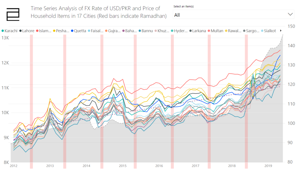
I have included a visual aid to point out the period during which prices were effected because of the holy month of Ramadhan. Here we are not examining the point that the hike in price the caused due to ill means as there is no data to validate that at the moment.
I will help you understand the interface of the dashboard then you can do your own analysis.
There are two graphs:
- Line Chart: Showcasing price of items over the period of the item, in 5 major cities of the country.
- Correlation Plot: This shows if the price has a negative or position correlation with the USD. Although it will be an oversimplification but use this as rule of thumb. If the line is rising towards the right this would mean that whenever the rate of the dollar goes up, the price of the item has gone up.
Using the visual:
- Simply select the item you want to analyse and the plots will update.
- At the bottom centre, there are page numbers which you can use to navigate to different types of the same chart.
Lets look at few examples:
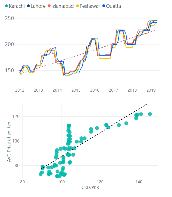
Example of Tea:
There is an increase in price over the period of time and the correlation between the USD and the price of tea has been strong.
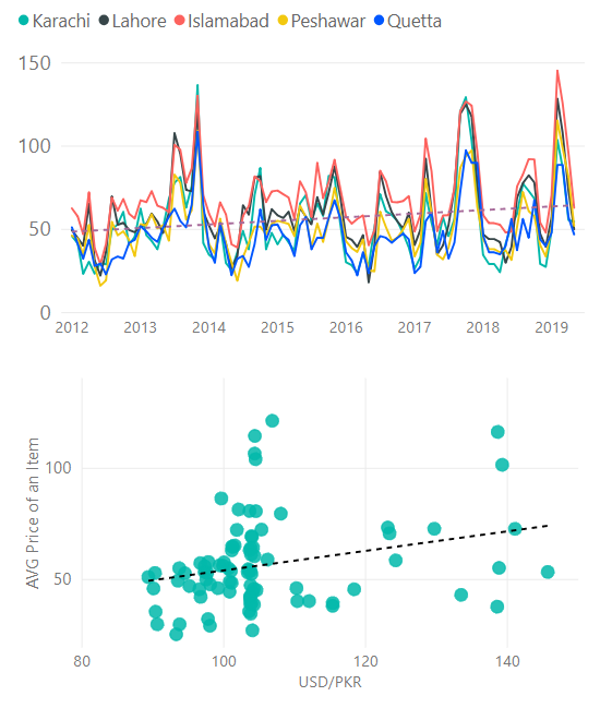
Example of Tomatoes:
On average trend shows that the price has gown up slightly, but the erratic behaviour due to the demand and supply is clear. The correlation plot doesn’t show a strong correlation between USD and price of tomatoes.
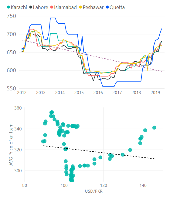
Example of Ghee:
Between 2013 and and 2017 the price of Ghee has gone down which was a showed a negative correlation but since 2018 and onward there is an strong correlation.
Example of Ramadhan:
Here you are viewing data from all cities overlayed on the graph of the USD, the red bars are indicative of the month of Ramadhan. If you will select an specific item, you would be able to see clearly which items demonstrated effect on the pricing during that month.
In conclusion:
This data is a very foundation which can be exploited to implement machine learning models to get predictions and see the effects of different policy in the sandbox.
This will further enables to study and improve policies in the test environment rather than production.
I hope that this will get the desired attention from the government of Pakistan.
Disclaimer: Please do consult before deriving any conclusion or using this to develop realistic policies. There are several uncertainties which has to be examined.
Data source:
Monthly Price Indices: http://www.pbs.gov.pk/cpi?page=7
Historical USD/PKR rate: https://www1.oanda.com/fx-for-business/historical-rates