While working at one of the data centers in London, I was asked to develop a solution which helps them with the mapping of future projects of building data centers overlaying on top of their marketing pipeline.
What this means is that they have data of potential clients in their pipeline and they also had the data of the land bank they will have in the future.
They wanted to see how does it look like when viewed on any visual.
I won’t go into the details of the data sources and how this was created but I will explain what this visualisation represents.
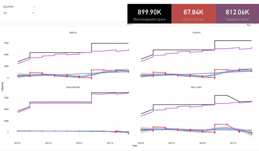
Equipped Space(sqm): Space in the data center which is currently occupied by the clients. It decreases when clients in the pipeline start their contract as it is the time when they occupy space, while it will increase when the contract comes to an end.
Left to Sell (sqm): In theory, it is a difference between Maximum Equippable Space and Equipped Space but that may not be the case depending on how an organisation may define these words. It behaved opposite to Equipped Space.
Maximum Equippable Space (sqm): Total Space which datacenter can sell. This is not a dependency on above two variables but in order to save cost and manage the expectations of the clients this has to be quantified. This increases when there is a new area constructed on the same site or a new site may go live.
There can be multiple data centers in one city.
In the visual we see 4 Data Centers in Berlin, London, Manchester and New York.
Black line represents Max. Equippable Space,.
Red represents Left to Sell.
Purple represents Equipped Space.
While blue line is a linear model is a simple prediction of demand based on historical trends.
This was built on Power BI in R visual.